東京的南青山,一幢吸引著萬千目光的奇妙建築拔地而起。這便是 Neil Barratt 與Zaha Hadid 建築師事務所舉世無雙的合作計劃。
Zaha Hadid 女士無愧為當今全球頂尖的建築設計專家,在她的嚴格督促之下,同時緊抓著專業技術與建築美學上的高要求,這也為他們事務所帶來了享譽全球的美譽,可謂是兩 手抓,兩手都硬!這無疑最是對地震高發地日本人的口味了。此次的合作是其近期對於時尚界為數不多的摸索,另外也是她首次操作的零售空間的計劃。
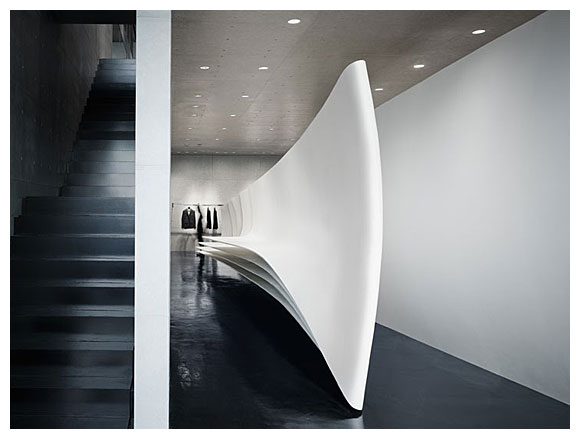
這次的合作組合中 Zaha Hadid 與其合夥人 Patrik Schumacher 共同操刀,在Neil Barrett東京旗艦店的設計中他們成功轉換了建築學與雕刻藝術上的傳統位置,使之現代化的完美融合,在建築中亦可賞見雕刻藝術品的美感。對牆壁的處理 上他們突破了過往,設計出了一道道、一輪輪平行的褶皺形波浪的花樣,起到了延續性以及延伸性的視覺效果。Zaha Hadid女士對此說道:「這一簡潔卻又繁複的處理手法的靈感來源於Neil Barrett的品牌精神,這使我一看就想起了它。對我而言,這是一種本能。」
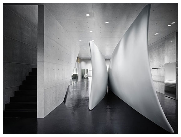
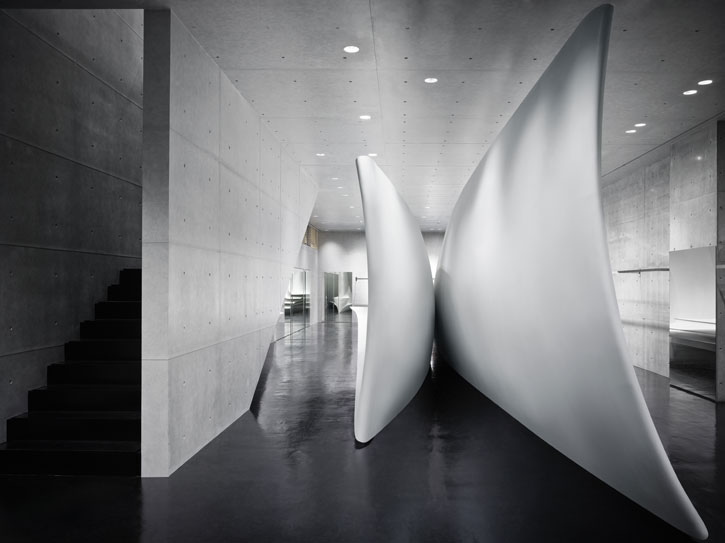
臨近通往2樓的樓梯邊的空地上則是猝不及防地峰巒聳起。兩面對視著的完美弧線交相輝映,像是巨鷹張開的翅膀,欲要展翅飛騰,栩栩如生。但事實上,它們僅是 一對有趣的商品陳列架。那兩片「翅膀」不僅是擺著好看,亦是起到了刀切兩面的作用,將那片空間分割開來,給顧客們起到了良好的私密性。
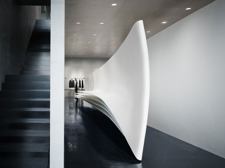
咫尺之遙的2樓女裝成衣專賣則是與之相反,它更是為性格嫻婉的女士設計。這一片空間是屬於舒適、閒散的。它使用了較低的天花板高度,以及2樓的最 大看點:用摺疊與圓括形狀的圓弧形牆面起到視覺柔化效果的設計營造出了一派連續的、折衷效果的氛圍。這流暢的質感便像是翩翩女子,水一般的順滑、和諧。而 大膽又嶄新的觀念卻儘是隱匿其中,這一切都是用來不斷柔化掉Neil Barrett生冷、晦澀、肅殺的感覺。
總體而言,本次Zaha Hadid女 士的水準甚高,凝聚了動感和創意,結合了天然地形與人為建築,令建築、景觀和材質巧妙地融匯在了一起。澎湃的活力在無縫的拼接、幾何的形狀中蠢蠢欲動,忽 而欲出。當然,這一切更是架構在了其先進的技術手段上。我敢相信,這一出自人類本能性的建築手法將會受到世界各地時尚品牌旗艦店的歡迎與重視。另外, Neil Barrett本人更是罕見地來到東京啟動了開幕儀式。
以下是媒體對 Neil Barrett 之採訪內容:
媒:How involved were you in the concept of this shop?
Neil Barrett: When we sat down to discuss what we were going to do, Zaha came up with a concept in the first ten minutes. She knew exactly what she wanted to do, and I loved it. It's just like when I design my collection—if I don't like the design right away then I throw it out. If it is not eye-catching enough to get someone's attention when walking past it on the racks then it's garbage. The design of this shop was equally instinctive—Zaha, Patrick and I were on the same page of what the shop needed to be about.
媒:Why choose Japan to unveil the new look?
Neil Barrett: I had been thinking about opening a new shop in this Aoyama district for a while now. It was natural to debut the design here, because if you can make it in Japan then you can make it anywhere.
媒:Isn't that what they say about New York?
Neil Barrett: In fashion commerce it really is about Japan. They're vastly fashion conscious—it's hard to compare to anywhere else—and they pull off my designs so well. It is the perfect place to start before rolling out the designs to my other shops.
媒:Your designs are rooted in classicism but Hadid's are largely futuristic. Are you now focusing on the future?
Neil Barrett: Definitely. It's not so symbolic, though. I am hoping to expand my retail and focus on my collections—I have been able to perfect the cutting of my menswear for a great slim fit, but I'm still perfecting my womenswear. It's not there yet, but close. Also I don't rely on advertising—I don`t use ads at all—so I am hoping the word continues to spread like it has. I'm really grateful for that.
媒:What about the distant future? One hundred years from now?
Neil Barrett: Well, I'll just be dead then!
*採訪人:Misha Janette from JCR
Zaha Hadid has designed a new flagship store for Neil Barrett in Tokyo. The duo teamed up with Patrik Schumacher to create a shop that shifts between architecture and sculpture, designed to parallel the same folding, pleating, cut-out and fixed-point design ethos utilized in the brand's clothing. It seems to be a continuation of her fluid formal language w/ one of the most ambitious Corian projects to date.
>>相關資料
設計案:NEIL BARRETT 東京旗艦店 FLAGSHIP STORE [TOKYO, JAPAN] / 2008
業主:Neil Barrett
設計案位置:日本東京 南青山 Aoyama, Tokyo, Japan
建築師:Zaha Hadid Architects
設計:Zaha Hadid, Patrik Schumacher
設計團隊:Claudia Wulf, Elke Presser, Torsten Broeder
Fabrication: Cutting Edge (UK)
Surface Material Supply: DuPont
Furniture Dimension / Ground floor: / H 3.00 m, W 2.60 m, L 15.80 m / Footprint: 2.00 m2
Furniture Dimension / First floor: / H 2.80 m, W 3.70 m, L 8.40 m / Footprint: 2.20 m2
>>相關圖片
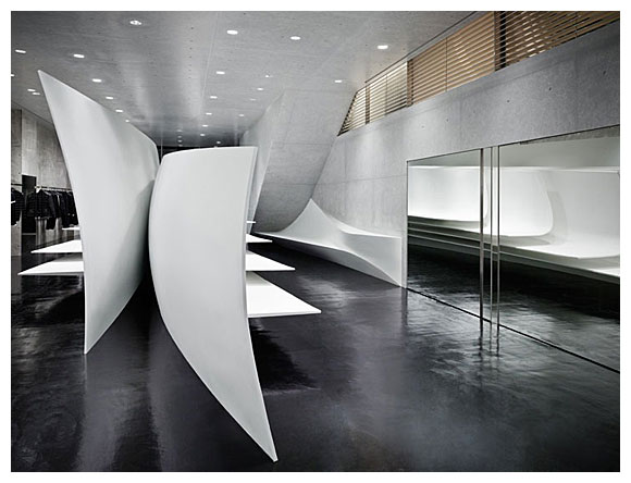
↗ Zaha Hadid 設計之NEIL BARRETT 東京旗艦店 01(點圖看大圖)
Principle
Our concept for the Neil Barrett flagship store in Tokyo is based on the minimal cut of the brand`s fashion design and parallels its approach in using the same design parameters of fixed points, folding, pleating and cut outs.
Rather than defining a single room or space, our design creates a circular passage allowing the customer to experience the space in multiple ways and interpretations.
Furniture staged in key points throughout the store creates the spatial concept of a narrow enclosure changing to an open condition. In two formal elements the design shifts between architecture and sculpture, where a compact mass of surface layers unravel and fold to form the shelving display and seating. The emerging folds will be used as display area for the NB accessory collection.
Formal Language and Materiality
The concept of the store plays with the complementary characteristics and the related dualism between male and female. This is echoed in the furniture design on both floors through the formal language and tactile quality of the materials used. The furniture piece on the ground floor is designed as a strong, masculine and dynamic form whilst the piece on the first floor enunciates femininity through more fluid contour lines. The first floor is designed in a more playful manner creating different zones that maintain the perspective view between them.
This interplay between male and female is followed through in the general aesthetic concept , setting the furniture piece with a white smooth Corian finish against the raw fair faced concrete surface of the rest of the space. This is further accentuated through the contrast in colour and finish of the white matt furniture finish against a black glossy floor.
Production Process
The final designs are shaped by 3D computer generated models. These are processed by the manufacturer using further software to thermoform the sheet Corian into the 3D designed surfaces. A series of these surfaces will be fabricated with joints, ready to be assembled into larger sections on site. Using the latest 3D modelling and CNC programming solutions, we are able to guarantee a very precise and automatic translation of the design into the built structure.
Zaha Hadid 女士無愧為當今全球頂尖的建築設計專家,在她的嚴格督促之下,同時緊抓著專業技術與建築美學上的高要求,這也為他們事務所帶來了享譽全球的美譽,可謂是兩 手抓,兩手都硬!這無疑最是對地震高發地日本人的口味了。此次的合作是其近期對於時尚界為數不多的摸索,另外也是她首次操作的零售空間的計劃。
這次的合作組合中 Zaha Hadid 與其合夥人 Patrik Schumacher 共同操刀,在Neil Barrett東京旗艦店的設計中他們成功轉換了建築學與雕刻藝術上的傳統位置,使之現代化的完美融合,在建築中亦可賞見雕刻藝術品的美感。對牆壁的處理 上他們突破了過往,設計出了一道道、一輪輪平行的褶皺形波浪的花樣,起到了延續性以及延伸性的視覺效果。Zaha Hadid女士對此說道:「這一簡潔卻又繁複的處理手法的靈感來源於Neil Barrett的品牌精神,這使我一看就想起了它。對我而言,這是一種本能。」
臨近通往2樓的樓梯邊的空地上則是猝不及防地峰巒聳起。兩面對視著的完美弧線交相輝映,像是巨鷹張開的翅膀,欲要展翅飛騰,栩栩如生。但事實上,它們僅是 一對有趣的商品陳列架。那兩片「翅膀」不僅是擺著好看,亦是起到了刀切兩面的作用,將那片空間分割開來,給顧客們起到了良好的私密性。
咫尺之遙的2樓女裝成衣專賣則是與之相反,它更是為性格嫻婉的女士設計。這一片空間是屬於舒適、閒散的。它使用了較低的天花板高度,以及2樓的最 大看點:用摺疊與圓括形狀的圓弧形牆面起到視覺柔化效果的設計營造出了一派連續的、折衷效果的氛圍。這流暢的質感便像是翩翩女子,水一般的順滑、和諧。而 大膽又嶄新的觀念卻儘是隱匿其中,這一切都是用來不斷柔化掉Neil Barrett生冷、晦澀、肅殺的感覺。
總體而言,本次Zaha Hadid女 士的水準甚高,凝聚了動感和創意,結合了天然地形與人為建築,令建築、景觀和材質巧妙地融匯在了一起。澎湃的活力在無縫的拼接、幾何的形狀中蠢蠢欲動,忽 而欲出。當然,這一切更是架構在了其先進的技術手段上。我敢相信,這一出自人類本能性的建築手法將會受到世界各地時尚品牌旗艦店的歡迎與重視。另外, Neil Barrett本人更是罕見地來到東京啟動了開幕儀式。
以下是媒體對 Neil Barrett 之採訪內容:
媒:How involved were you in the concept of this shop?
Neil Barrett: When we sat down to discuss what we were going to do, Zaha came up with a concept in the first ten minutes. She knew exactly what she wanted to do, and I loved it. It's just like when I design my collection—if I don't like the design right away then I throw it out. If it is not eye-catching enough to get someone's attention when walking past it on the racks then it's garbage. The design of this shop was equally instinctive—Zaha, Patrick and I were on the same page of what the shop needed to be about.
媒:Why choose Japan to unveil the new look?
Neil Barrett: I had been thinking about opening a new shop in this Aoyama district for a while now. It was natural to debut the design here, because if you can make it in Japan then you can make it anywhere.
媒:Isn't that what they say about New York?
Neil Barrett: In fashion commerce it really is about Japan. They're vastly fashion conscious—it's hard to compare to anywhere else—and they pull off my designs so well. It is the perfect place to start before rolling out the designs to my other shops.
媒:Your designs are rooted in classicism but Hadid's are largely futuristic. Are you now focusing on the future?
Neil Barrett: Definitely. It's not so symbolic, though. I am hoping to expand my retail and focus on my collections—I have been able to perfect the cutting of my menswear for a great slim fit, but I'm still perfecting my womenswear. It's not there yet, but close. Also I don't rely on advertising—I don`t use ads at all—so I am hoping the word continues to spread like it has. I'm really grateful for that.
媒:What about the distant future? One hundred years from now?
Neil Barrett: Well, I'll just be dead then!
*採訪人:Misha Janette from JCR
Zaha Hadid has designed a new flagship store for Neil Barrett in Tokyo. The duo teamed up with Patrik Schumacher to create a shop that shifts between architecture and sculpture, designed to parallel the same folding, pleating, cut-out and fixed-point design ethos utilized in the brand's clothing. It seems to be a continuation of her fluid formal language w/ one of the most ambitious Corian projects to date.
>>相關資料
設計案:NEIL BARRETT 東京旗艦店 FLAGSHIP STORE [TOKYO, JAPAN] / 2008
業主:Neil Barrett
設計案位置:日本東京 南青山 Aoyama, Tokyo, Japan
建築師:Zaha Hadid Architects
設計:Zaha Hadid, Patrik Schumacher
設計團隊:Claudia Wulf, Elke Presser, Torsten Broeder
Fabrication: Cutting Edge (UK)
Surface Material Supply: DuPont
Furniture Dimension / Ground floor: / H 3.00 m, W 2.60 m, L 15.80 m / Footprint: 2.00 m2
Furniture Dimension / First floor: / H 2.80 m, W 3.70 m, L 8.40 m / Footprint: 2.20 m2
>>相關圖片
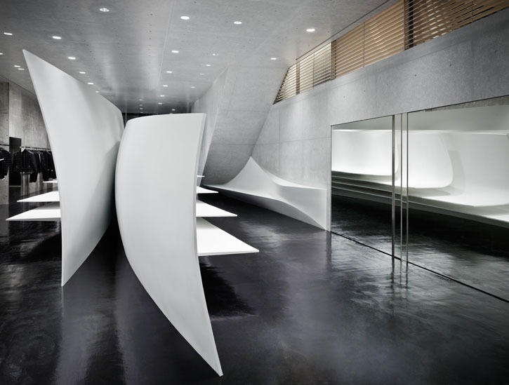
↗ Zaha Hadid 設計之NEIL BARRETT 東京旗艦店 01(點圖看大圖)
Principle
Our concept for the Neil Barrett flagship store in Tokyo is based on the minimal cut of the brand`s fashion design and parallels its approach in using the same design parameters of fixed points, folding, pleating and cut outs.
Rather than defining a single room or space, our design creates a circular passage allowing the customer to experience the space in multiple ways and interpretations.
Furniture staged in key points throughout the store creates the spatial concept of a narrow enclosure changing to an open condition. In two formal elements the design shifts between architecture and sculpture, where a compact mass of surface layers unravel and fold to form the shelving display and seating. The emerging folds will be used as display area for the NB accessory collection.
Formal Language and Materiality
The concept of the store plays with the complementary characteristics and the related dualism between male and female. This is echoed in the furniture design on both floors through the formal language and tactile quality of the materials used. The furniture piece on the ground floor is designed as a strong, masculine and dynamic form whilst the piece on the first floor enunciates femininity through more fluid contour lines. The first floor is designed in a more playful manner creating different zones that maintain the perspective view between them.
This interplay between male and female is followed through in the general aesthetic concept , setting the furniture piece with a white smooth Corian finish against the raw fair faced concrete surface of the rest of the space. This is further accentuated through the contrast in colour and finish of the white matt furniture finish against a black glossy floor.
Production Process
The final designs are shaped by 3D computer generated models. These are processed by the manufacturer using further software to thermoform the sheet Corian into the 3D designed surfaces. A series of these surfaces will be fabricated with joints, ready to be assembled into larger sections on site. Using the latest 3D modelling and CNC programming solutions, we are able to guarantee a very precise and automatic translation of the design into the built structure.